Data is only as powerful as how well it’s communicated. Power BI, Microsoft’s flagship data visualization tool, helps transform rows of numbers into visuals that tell a story. But with so many visuals available, which charts are most effective? In this guide, we’ll explore the 10 most commonly used Power BI charts and break down their advantages. This will help you choose the right visual for your data—without any guesswork.
Bar and column charts are foundational in Power BI. Column charts illustrate data using vertical bars, while bar charts display horizontal bars. They’re great for comparing different categories or tracking changes over time.
Why It’s Popular:
These charts can be stacked, clustered, or displayed as 100% stacked charts for percentage-based analysis. This is one of the earliest forms of data visualization and still holds value in modern business intelligence environments. Over time, this chart type has evolved with new customization options in Power BI, making it even more interactive.
Line charts are used to show trends over continuous time periods. They connect data points using lines and work well for visualizing growth, patterns, and fluctuations.
Why It’s Popular:
Line charts can also be enhanced with markers to draw attention to specific points. Customization options in Power BI allow users to add reference lines or use conditional formatting in line charts.
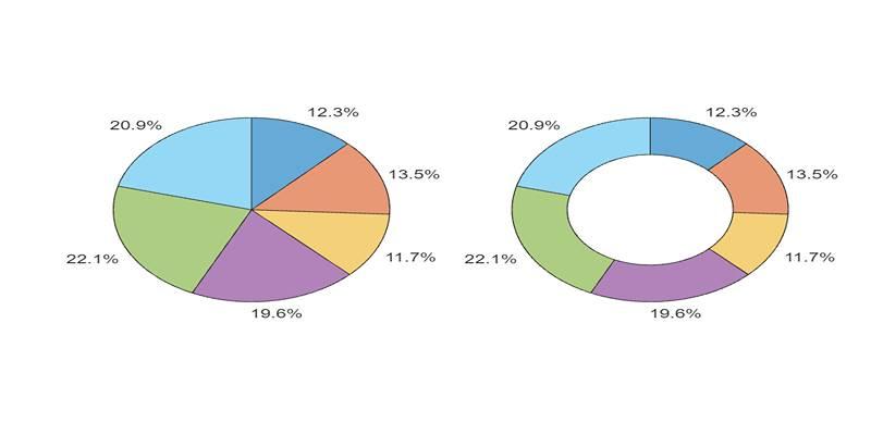
These circular charts represent proportions of a whole. While pie charts show a single series, donut charts add a hole in the center for a modern look or extra data.
Why It’s Popular:
The circular layout of pie charts makes it very intuitive for users to identify dominant segments in a dataset. However, be cautious using too many slices, as it can clutter the visual. Pie charts may lack precision, but they are excellent for quick overviews in dashboards.
Area charts fill the space beneath a line chart to emphasize volume. They’re ideal for cumulative data, such as revenue over time or user growth.
Why It’s Popular:
Area charts can become difficult to interpret when many series overlap. Still, they offer a quick visual sense of scale and volume changes.
Scatter charts plot two measures using x and y axes. Bubble charts add a third value, using size to represent the third dimension.
Why It’s Popular:
These visuals are useful in identifying patterns and are best when data relationships need to be examined. They allow multidimensional exploration without overwhelming the viewer.
TreeMaps display data hierarchically using nested rectangles. Each box’s size and color represent different values.
Why It’s Popular:
When using TreeMap, it's important to structure the hierarchy in a way that tells a meaningful story. It’s especially helpful when communicating with stakeholders who prefer visual clarity over complex analytical visuals.
Waterfall charts show incremental increases and decreases in a value across a process—ideal for financial breakdowns.
Why It’s Popular:
Waterfall charts are highly effective for executive-level summaries, especially when illustrating financial breakdowns. They clarify how a starting value changes over time due to different inputs.
Funnel charts represent stages in a process—most often used in marketing or sales pipelines.
Why It’s Popular:
Funnel charts are not limited to sales data; they can represent any process with defined stages. Each stage's width represents the volume at that point, making it easy to spot bottlenecks.
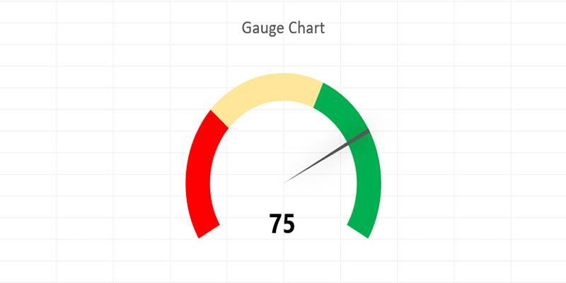
Gauge charts look like speedometers and show progress toward a target. They are best for key metrics, such as performance against goals.
Why It’s Popular:
Users often pair gauge charts with KPIs to monitor business performance in real time. While they show only a single metric, they are effective for dashboards.
Power BI’s map visuals help visualize location-based data using shapes, bubbles, or colors.
Why It’s Popular:
Power BI Maps use Bing Maps integration, allowing dynamic zooming and precise geo-mapping. It’s one of the most intuitive ways to spot regional trends or compare data across territories.
Choosing the best chart isn’t just about appearance—it’s about data clarity.
Here’s what to consider:
Power BI charts are essential tools for transforming raw data into actionable insights. Whether you're visualizing trends over time with line charts or highlighting process drop-offs using funnel visuals, each chart type serves a unique purpose. Understanding the strengths and limitations of each helps ensure your data is not only presented clearly but also interpreted correctly by your audience.
By selecting the right chart based on your data type and communication goals, you create dashboards that are not just functional—but genuinely insightful. The 10 charts covered in this guide are among the most widely used and effective, making them a great starting point for building impactful reports. With practice and thoughtful design, Power BI charts can become powerful tools in your decision-making process.

Discover how autonomous robots can boost enterprise efficiency through logistics, automation, and smart workplace solutions

Explore how Meta AI on WhatsApp is revolutionizing mobile use with smart chats, planning, creativity, and translation.

Discover how hospital IoT, wearable health trackers, and AI‑powered patient monitoring improve healthcare services today

Build a simple LLM translation app using LangChain, LCEL, and GPT-4 with step-by-step guidance and API deployment.

YouTube channels to learn SQL, The Net Ninja, The SQL Guy

Discover how Replit Agent simplifies coding, testing, and deployment using natural language in an all-in-one platform.

Every aspect of OpenAI's GPT-4.5, which presents better conversational performance alongside improved emotional awareness abilities and enhanced programming support and content creation features

Unlock the potential of AI for market analysis to understand customer needs, predict future trends, and drive smarter business decisions with accurate consumer behavior prediction

Discover these 7 AI powered grammar checkers that can help you avoid unnecessary mistakes in your writing.

Master how to use DALL-E 3 API for image generation with this detailed guide. Learn how to set up, prompt, and integrate OpenAI’s DALL-E 3 into your creative projects

AI and the Metaverse are shaping the future of online communication by making virtual interactions smarter, more personal, and highly engaging across digital spaces

Learn about the main types of AI agents in 2025 and how they enable smart, autonomous decision-making systems.